t shirt placement guide

The T-Shirt Placement Guide is essential for creating visually appealing designs. Strategic placement ensures designs stand out‚ aligning with fabric type‚ shirt color‚ and design contrast. Tools like rulers and laser alignment aid precision‚ while balancing logos and graphics enhances overall aesthetics. This guide offers comprehensive tips for effective design placement.
Why T-Shirt Placement Matters
T-Shirt placement is crucial for creating a polished‚ professional look. Proper placement ensures designs are visually appealing and balanced‚ enhancing the overall aesthetic of the garment. Incorrect placement can make a design look unprofessional or poorly executed‚ potentially overshadowing the artwork or message. Placement also impacts wearability and comfort‚ as designs in inappropriate areas may irritate the skin or distort during movement. Understanding where to place designs ensures they complement the shirt’s fabric type‚ color‚ and style‚ making the final product more attractive and marketable. Strategic placement is key to achieving a design that stands out while maintaining harmony with the shirt’s structure.

Common T-Shirt Print Locations
Primary print locations include the full front‚ left chest‚ sleeves‚ and back. Each area serves different purposes‚ from bold statements to subtle branding‚ enhancing design impact effectively.
Full Front Placement
The full front placement is ideal for bold‚ eye-catching designs. It allows large graphics or text to dominate the shirt’s center‚ creating a striking visual impact. Measurements typically range from 10 to 12 inches wide and 12 to 15 inches tall‚ ensuring the design is prominent without overwhelming the garment. Placement begins 1-2 inches below the collar‚ centered horizontally. This area works well for logos‚ slogans‚ or intricate artwork. Fabric type and color contrast are crucial for visibility. Tools like alignment guides or rulers help achieve precise centering. This placement is versatile‚ suiting various shirt sizes and styles‚ making it a popular choice for maximum visibility and brand impact.
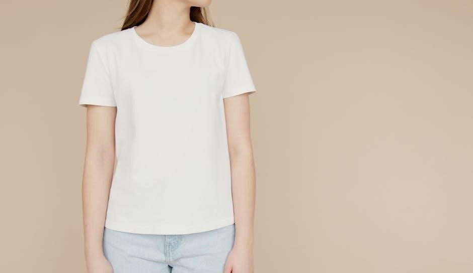
Left Chest Placement
The left chest placement is a popular choice for a polished‚ professional look. Typically‚ designs are placed 7 to 9 inches below the shoulder seam and 4 to 6 inches from the center. This area is ideal for small logos or text‚ ensuring the design complements the shirt without overwhelming it. It works well for company logos‚ button-down shirts‚ or subtle branding. The placement creates a balanced look‚ keeping the design visible but not dominant. Measuring from the shoulder seam ensures alignment‚ while contrasting colors enhance visibility. This placement is versatile‚ suitable for various shirt styles‚ including polo shirts and casual tees‚ making it a timeless option for professional and casual designs alike.
Sleeve Placement
Sleeve placement adds a modern‚ subtle flair to T-shirt designs. Ideal for small logos or complementary graphics‚ it enhances the overall aesthetic without overwhelming the shirt. Designs are typically placed 3 to 4 inches from the shoulder seam and centered vertically. This placement works well for branding‚ sponsors‚ or secondary artwork. The sleeve offers a unique canvas‚ allowing for creative expression while maintaining a clean look. Ensure designs are proportionate to the sleeve length and width for balance. Contrasting colors with the sleeve fabric can make the design stand out. This placement is perfect for adding detail without distracting from the main design on the chest or back.
Back Placement
Back placement is ideal for bold‚ eye-catching designs or detailed graphics. It offers a large canvas‚ making it perfect for intricate artwork or extensive text. Designs are typically centered and aligned with the full front print for a balanced look. The back placement is popular for band tees‚ event graphics‚ or promotional messaging. Ensure the design is proportionate to the shirt size‚ with larger graphics reserved for bigger shirts. The design should be placed 6 to 8 inches below the collar seam for optimal visibility. This placement allows for maximum impact‚ making it a favorite for statement-making designs that stand out clearly from a distance.

Design Sizing and Placement Tips
Ensure designs are proportional to shirt size for a balanced look. Strategic placement enhances visual appeal‚ while proper sizing maintains clarity and aesthetic harmony in every print location.
Understanding Design Proportions
Properly proportioning your design ensures it looks great on any shirt size. Measure from the collar to the hem for vertical placement‚ and across the chest for horizontal alignment. For smaller shirts‚ keep designs closer to the top‚ around 1.5 inches below the collar‚ while larger shirts allow for more space‚ up to 3 inches. Sleeves should have smaller graphics‚ placed 5-7 inches from the shoulder seam. Use a ruler or alignment tool to maintain consistency. Balancing proportions ensures the design doesn’t overwhelm or get lost on the fabric‚ creating a polished and professional appearance every time.
Measuring for Accurate Placement
Precise measurements are crucial for professional-looking designs. Start by identifying key reference points‚ such as the collar‚ shoulder seams‚ and side seams. For chest placement‚ measure 1.5 to 3 inches below the collar‚ depending on the design height. Sleeves require smaller graphics‚ typically 5-7 inches from the shoulder seam. Use a T-shirt placement ruler to ensure accuracy and consistency. Record measurements for repeat orders‚ especially for customers with specific preferences. Folding the shirt in half can help find the center for symmetrical designs. Always double-check measurements to avoid misalignment and ensure the design complements the garment proportions perfectly.
Popular Design Placement Measurements
- Chest Placement: 1.5 to 3 inches below the collar.
- Sleeve Prints: 5 to 7 inches from the shoulder seam.
- Left Chest: 7 to 9 inches from the shoulder seam.
Chest Placement Guidelines
Chest placement is a key element in t-shirt design. The sweet spot for chest placement is positioning the top of the transfer 1.5 to 3 inches below the collar. For shorter graphics or larger shirts‚ aim closer to 3 inches. Taller graphics or smaller shirts should be placed closer to 1.5 inches. This ensures the design is proportional and visually appealing. Always measure from the collar seam to the top of the design for accuracy. Keeping the design centered and balanced is crucial. Avoid overcrowding the chest area with excessive details‚ as this can detract from the overall aesthetic. Proper chest placement enhances both readability and visual impact.
Sleeve Print Dimensions
Sleeve prints add a modern flair to t-shirts. For optimal placement‚ measure 3.5 to 4 inches from the center edge and 6 to 8 inches from the shoulder seam on the left sleeve. Polo shirts typically require 7.5 to 9 inches from the shoulder seam and 4 to 6 inches from the center. Designs should be proportional to the sleeve length‚ with smaller graphics (3-4 inches wide and 2-3 inches tall) working best. Place logos or text near the upper sleeve for visibility or lower sleeve for subtlety. Use alignment tools like rulers or laser guides to ensure precision and balance. Proper sizing and positioning enhance the overall design aesthetic.
Tools for Perfect Placement
Tools like a T-Shirt Placement Ruler and Laser Alignment ensure accurate design placement. The ruler measures distances from seams and centers‚ while laser alignment guarantees precise positioning.
Using a T-Shirt Placement Ruler
A T-Shirt Placement Ruler is a versatile tool designed to help achieve precise design positioning. It typically features measurements for common placements like the chest‚ sleeves‚ and back. For chest designs‚ the ruler can measure 3.5 to 4 inches from the center edge and 6 to 8 inches from the left shoulder seam. This ensures symmetry and proper alignment. The ruler is especially useful for aligning graphics on both sleeves‚ ensuring consistency across the garment. Many rulers also include guides for different fabric types‚ helping to maintain accuracy regardless of the material. This tool simplifies the design process‚ ensuring professional results every time.
Laser Alignment for Precision
Laser alignment tools offer unmatched precision for t-shirt design placement. They ensure perfect symmetry and consistency‚ crucial for professional results. These tools often feature adjustable guides for various print locations‚ such as chest‚ sleeves‚ and back. By projecting a laser outline‚ they help accurately position designs‚ minimizing errors. This technology is particularly beneficial for intricate designs and bulk orders‚ ensuring each shirt meets high standards. Using laser alignment enhances efficiency and guarantees a polished finish‚ making it an invaluable asset for achieving flawless t-shirt design placement every time. Additionally‚ they are easy to integrate into existing workflows‚ improving overall production quality.
Factors Influencing Design Placement
Fabric type‚ shirt color‚ and design contrast significantly impact placement decisions. Ensuring harmony between these elements is crucial for a polished and professional appearance.
Fabric Type and Its Impact
Fabric type plays a crucial role in design placement. Thicker fabrics like cotton offer better stability for large prints‚ while thinner materials may distort designs. Stretchy fabrics require careful alignment to maintain visual integrity. The weave of the fabric also affects ink absorption and design visibility. For instance‚ loose weaves may cause designs to appear fuzzy‚ while tight weaves provide crisp‚ sharp images. Understanding fabric characteristics ensures optimal placement and prevents issues like design misalignment or uneven printing. These factors help in choosing the right fabric for specific design goals‚ enhancing both aesthetics and durability.
Shirt Color and Design Contrast
Shirt color significantly impacts design visibility and appeal. High-contrast colors‚ such as white on dark shirts‚ make designs stand out‚ while low-contrast options‚ like pastels on light shirts‚ create subtle looks. Dark-colored shirts may require brighter inks or special treatments for vibrant prints‚ while light shirts offer more versatility. The color also influences placement decisions‚ as certain areas like the chest or sleeves may look better with specific hues. Ensuring proper contrast enhances legibility and aesthetic balance‚ making the design more professional and visually striking. Understanding these dynamics is crucial for achieving the desired visual effect and professional finish.

Modern T-Shirt Design Trends
Modern designs emphasize minimalism‚ asymmetrical layouts‚ and eco-friendly prints. Trends include bold graphics‚ subtle-placement logos‚ and vibrant color contrasts‚ enhancing visual impact while maintaining style and functionality.
Current Trends in Placement
Current trends in t-shirt placement focus on minimalism and asymmetry‚ with designs often placed off-center or near the hem for a modern look. Bold graphics dominate the full front‚ while smaller logos are favored on sleeves or the left chest. Eco-friendly printing is also gaining traction. Striking color contrasts enhance visibility‚ ensuring designs pop against fabric tones; These trends blend style with functionality‚ making t-shirts versatile for both casual and professional settings. Balancing aesthetics and practicality‚ modern placement strategies ensure designs resonate with diverse audiences while maintaining a fresh‚ contemporary appeal.
Balancing Logos and Graphics
Balancing logos and graphics ensures a harmonious design. Pairing a small logo on the left chest with a larger graphic on the back creates visual equilibrium. Symmetry is key; placing elements evenly avoids clutter. Contrast enhances visibility‚ making designs stand out. Using complementary colors ensures logos and graphics complement each other. Placement guides help maintain proportion‚ preventing overwhelming the viewer. Proper spacing between elements is crucial for a polished look. These strategies ensure designs are both aesthetically pleasing and professional‚ making t-shirts appealing and wearable for various occasions while maintaining brand integrity and artistic expression.
Common Mistakes to Avoid
Avoid misalignment and proportion errors‚ as they can make designs look unprofessional. Neglecting fabric type and color harmony leads to poor visual appeal. Use placement guides and rulers to ensure accuracy and avoid costly mistakes.
Misalignment and Proportion Errors
Misalignment and proportion errors are common pitfalls in t-shirt design. Misaligned graphics can make the design look amateurish‚ while incorrect proportions can overwhelm or underwhelm the viewer. For instance‚ placing a large graphic too close to the collar or sleeves disrupts the balance. Similarly‚ small designs placed too low on the chest may get lost. Proper alignment ensures symmetry and visual appeal‚ while proportionate sizing guarantees the design complements the shirt’s dimensions. Using tools like rulers or laser alignment can help achieve precise placement. Additionally‚ recording measurements from past projects ensures consistency and avoids future errors.
Neglecting Fabric and Color Harmony
Neglecting fabric type and color harmony can ruin a design’s impact. Different fabrics‚ like cotton‚ polyester‚ or blends‚ absorb ink differently‚ affecting how designs appear. For example‚ a vibrant graphic on a dark shirt may fade or lose detail without proper contrast. Color harmony ensures the design complements the shirt’s hue‚ avoiding clashes. Ignoring these factors can make the design less visible or aesthetically pleasing. Always test designs on the specific fabric and color to ensure the final product looks professional and polished. Proper consideration of these elements enhances the overall appeal and longevity of the t-shirt design.
Effective placement ensures professional results. Use tools like rulers and laser alignment for precision. Test designs on specific fabrics and colors to guarantee successful‚ visually appealing t-shirts.
Final Tips for Effective T-Shirt Design Placement
To achieve professional results‚ ensure designs are balanced and proportionate. Measure carefully to avoid misalignment and proportion errors. Consider fabric type and shirt color for optimal contrast. Use tools like a T-shirt placement ruler or laser alignment for precision. Test designs on samples to verify placement and appearance; Record measurements for consistency in future orders. Fold shirts to find the center for accurate placement. For chest designs‚ place the top of the transfer 1.5 to 3 inches below the collar‚ adjusting based on graphic height and shirt size. Ensure logos complement the overall design and maintain visual harmony. Avoid neglecting fabric and color harmony to enhance the final product. By following these tips‚ you can create visually appealing and professional-looking t-shirts.